The Challenge:
With a well-known, family-owned brand, change needed to be thoughtful and restrained. The goal was to refine an already established look and feel. We needed to improve digital usability and visual clarity for the web while keeping print materials aligned to honor the brand’s history and recognition.
UX Designer, Usability Expert, Graphic Designer, and Web Developer
Guided brand development across web and print, ensuring proper procedures for all marketing material.
Highlights
A modernized brand system delivering consistency, speed, and long-term scalability.
6+
Marketing channels aligned
14%
Increase in pages per session
100%
Scalable system
Step 1
Visual Foundations
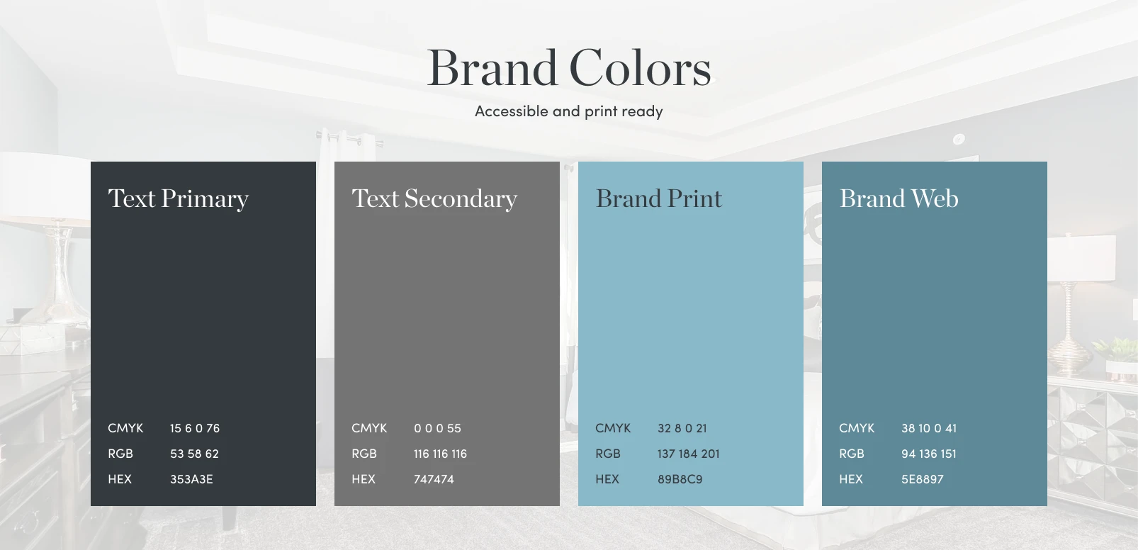
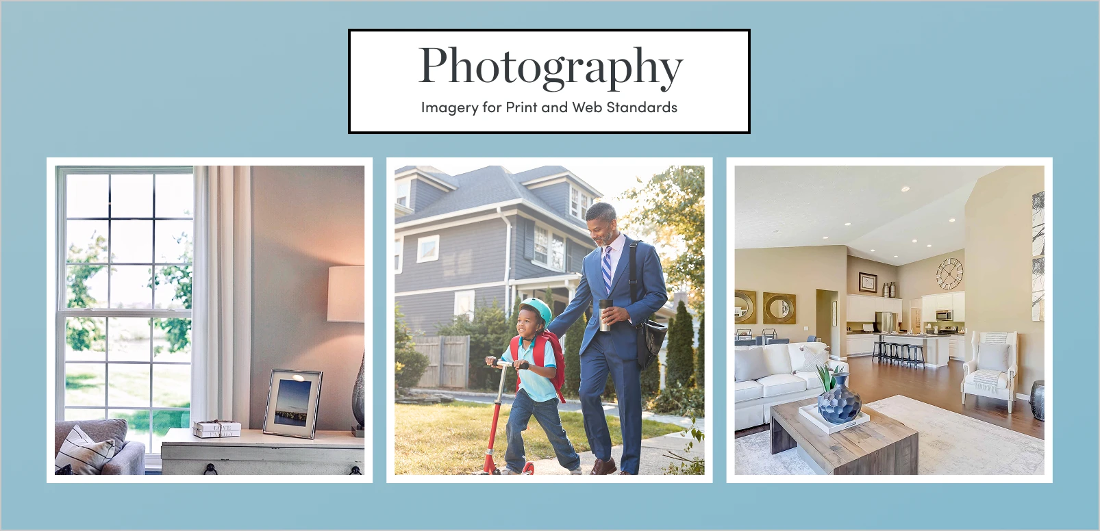
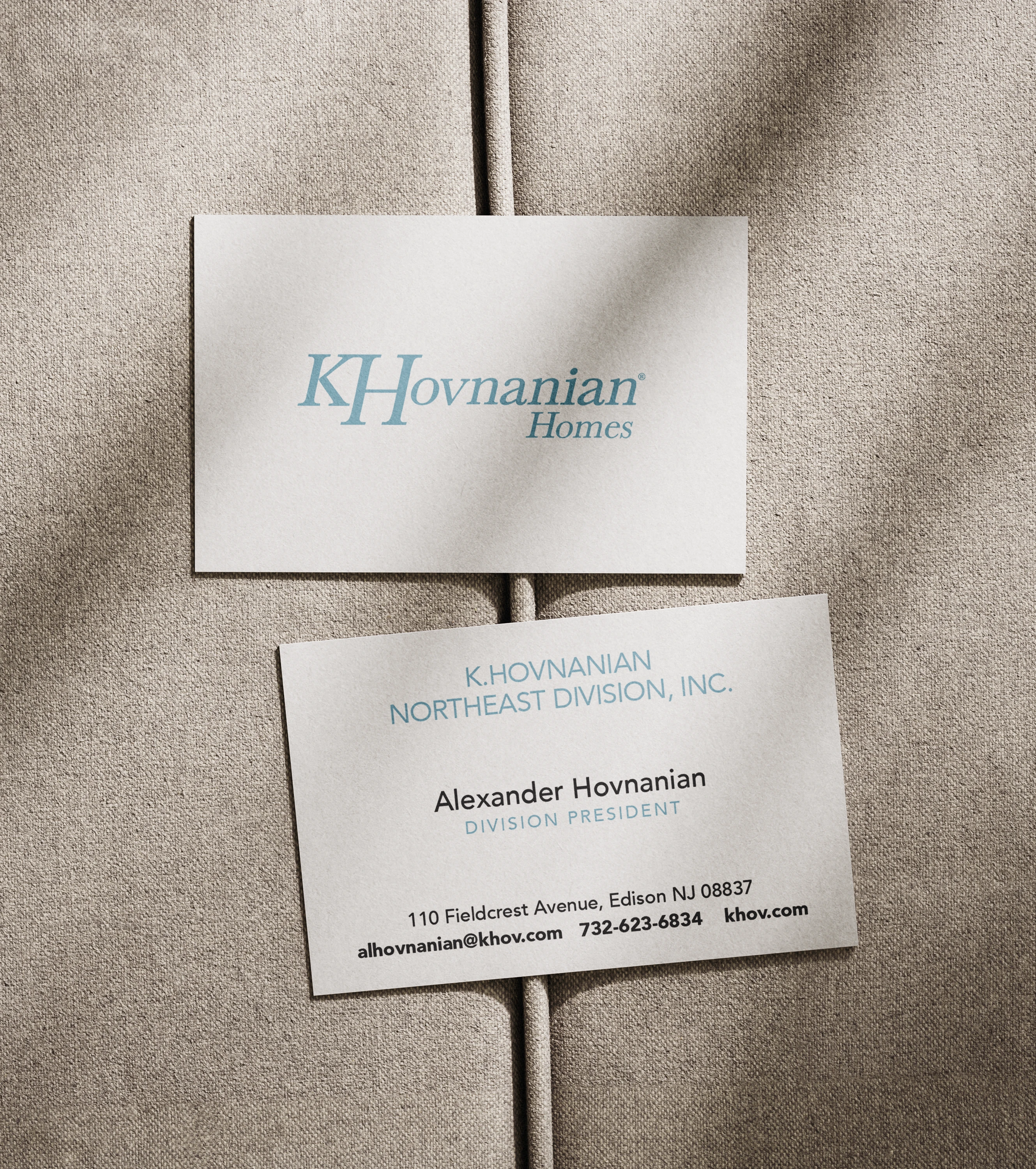
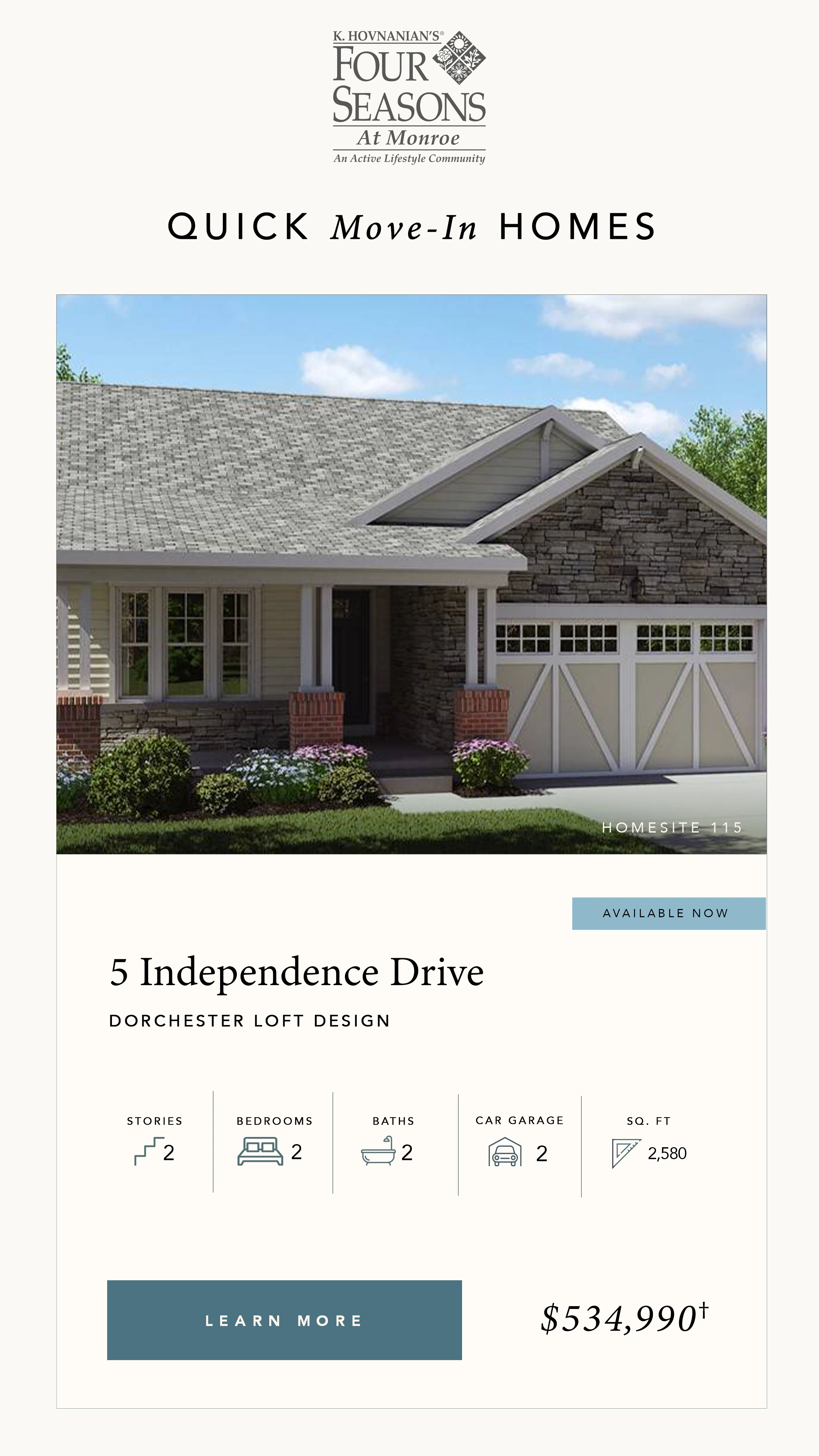
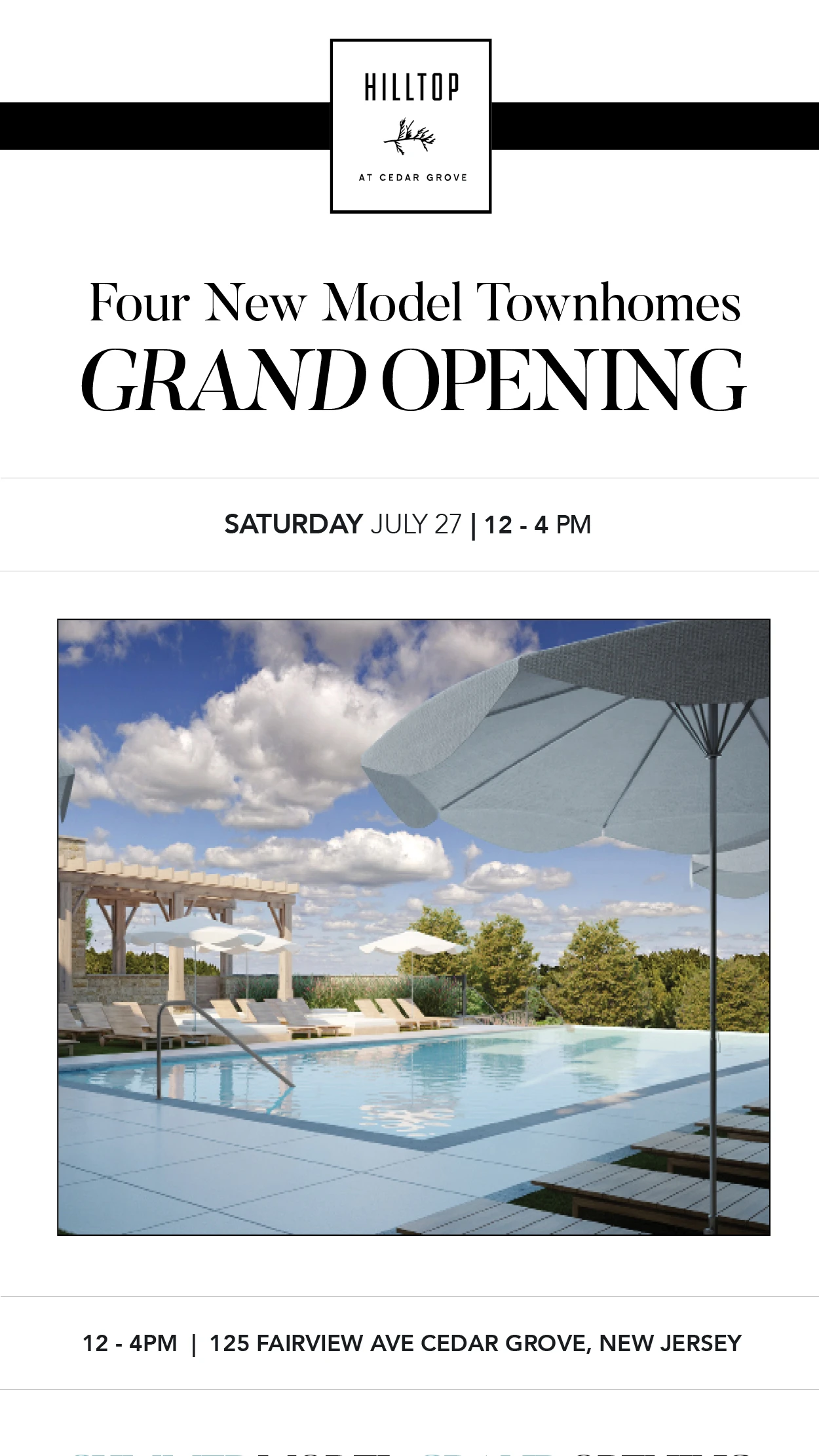
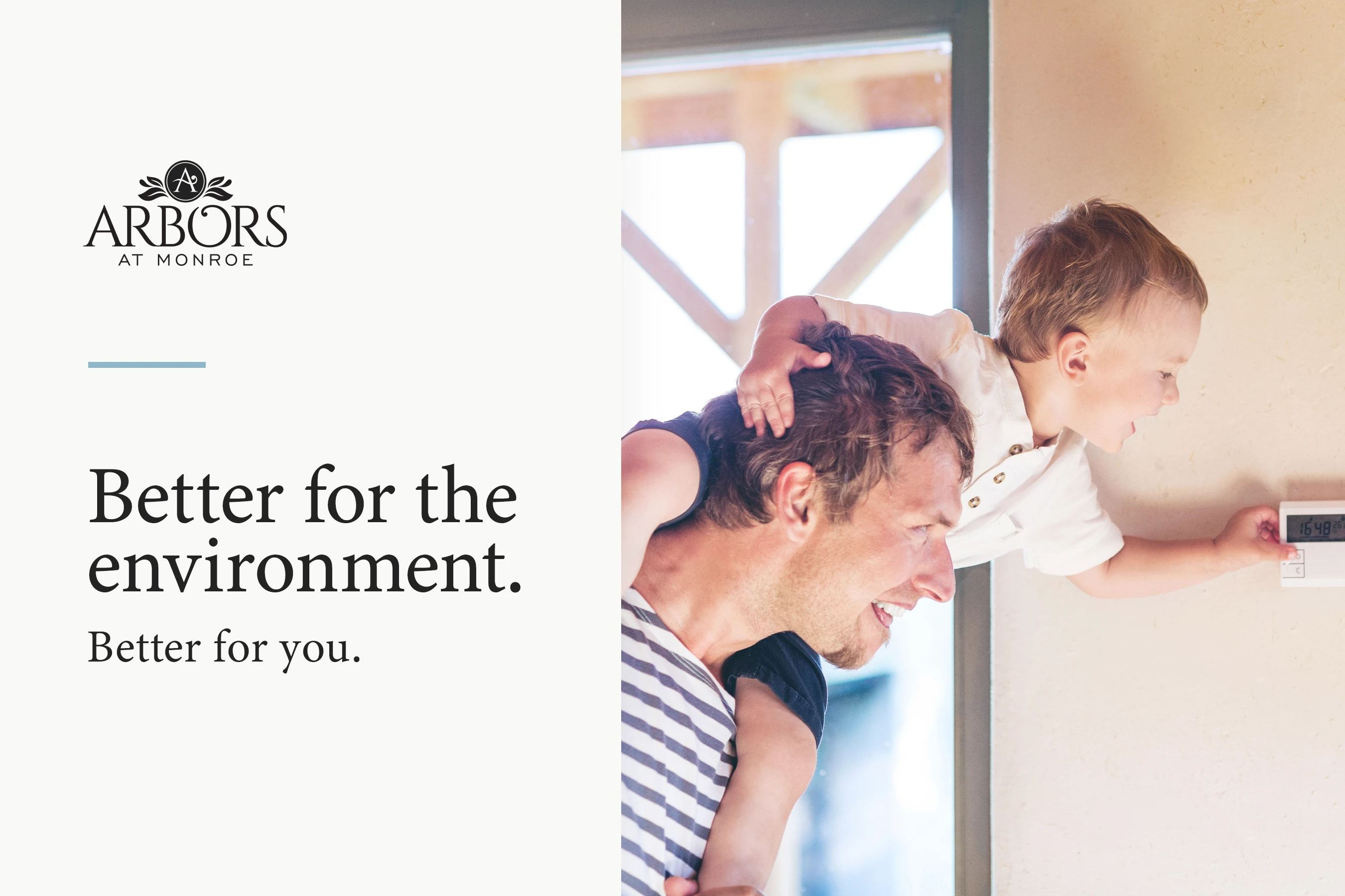
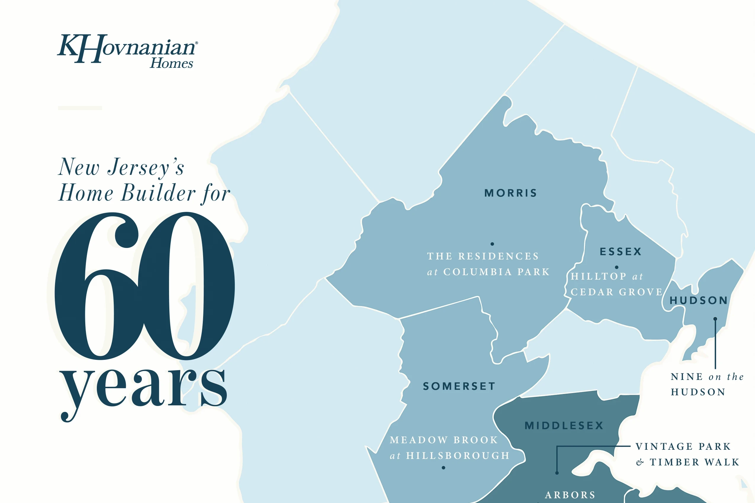
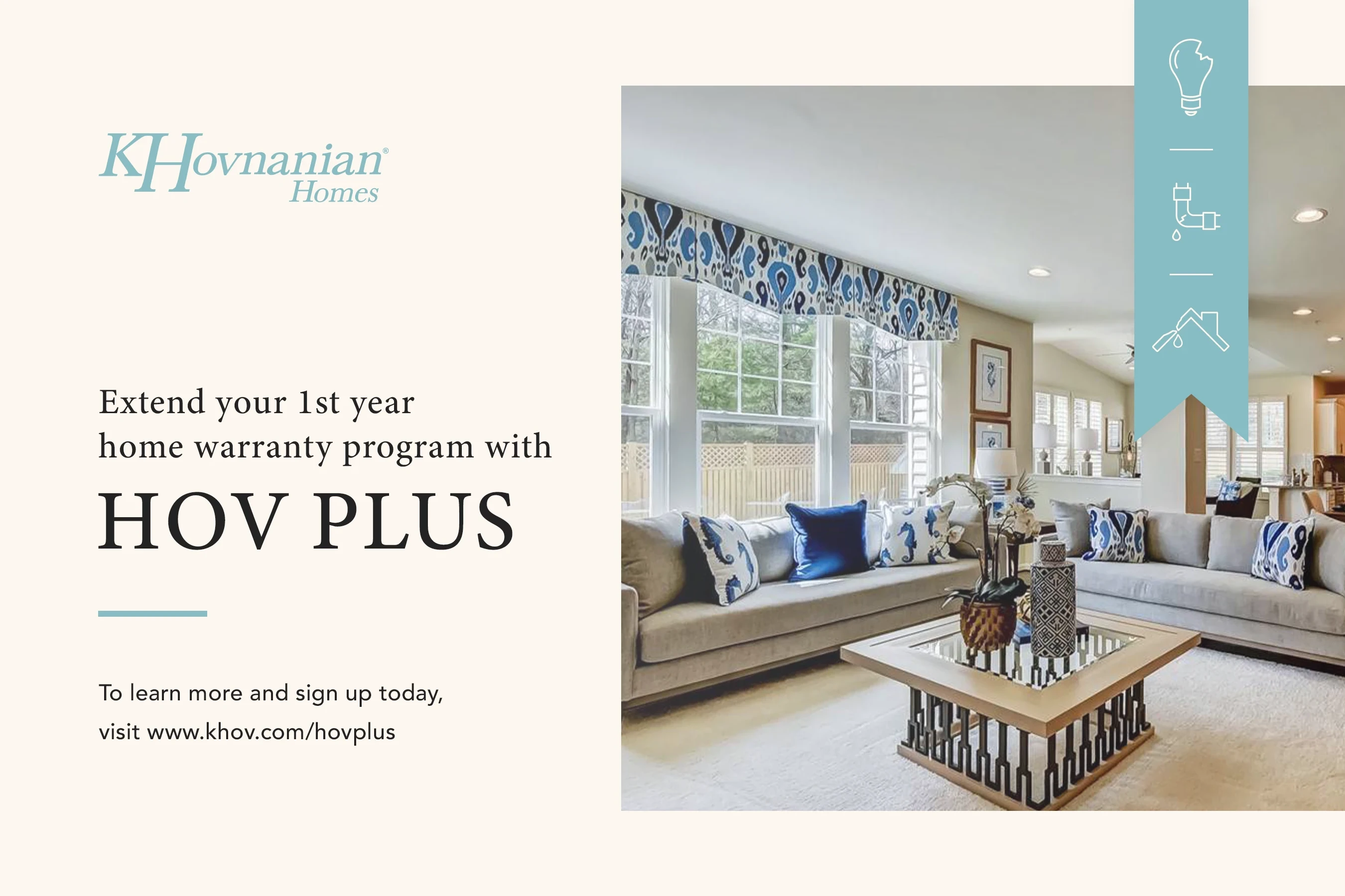
The core visual elements bring the brand to life across web, print, and motion. Colors, typography, and imagery were refined to feel modern, flexible, and consistent at every touchpoint. A Photoshop filter was applied to imagery, enabling quick implementation across internal and stock photography and ensuring a cohesive, on-brand aesthetic.


Step 4
A Thoughtful Website Refresh
As part of the broader rebrand, the website was refreshed to translate the company’s craftsmanship and attention to detail into a modern digital experience. I helped ensure the brand carried through every interaction while shaping a clear, intentional journey that reflects the quality of the homes themselves.

"Finding a Home Near You" Example Journey
Results
Post-refresh analytics showed users spending more time on the site and exploring more pages per visit, signaling increased engagement and interest.