The Challenge:
Before MyCPG, clergy and lay members had no centralized way to manage their own benefits. Simple tasks like updating a dependent, checking pension status, or reviewing coverage weren't clear enough to complete on their own, leaving users confused and reliant on a support team already stretched thin. The goal wasn't just to digitize these tasks, but to design an experience clear enough that users could act with confidence the first time.
Lead Designer, Content Strategist, Information Architect, UX Researcher, UX & UI Designer
Led end-to-end UX, from discovery to prototypes that defined the product.
Highlights
MyCPG now supports thousands of clergy, lay employees, and dependents across 10,000+ Episcopal institutions, empowering users to manage benefits, insurance, and pensions with ease.
33%
Increase in successful self-service tasks
4.7
User satisfaction rating
100%
Unified product experience
Step 1
Project Alignment & Requirements Mapping
Early on, I ran discovery sessions with stakeholders across support, compliance, and engineering to understand not just what the business wanted, but why existing processes were failing users. I mapped the full journey clergy and lay members took to manage benefits, from initial login through task completion, flagging every point of friction, confusion, or unnecessary handoff to support across what would ultimately become a 1,000+ screen application.
This became the shared reference point that got legal, compliance, and engineering speaking the same language about what "success" actually meant for this project. By translating scattered requirements into a single visual framework, I reduced back-and-forth discussions and gave the team a clear, agreed-upon foundation to design against.
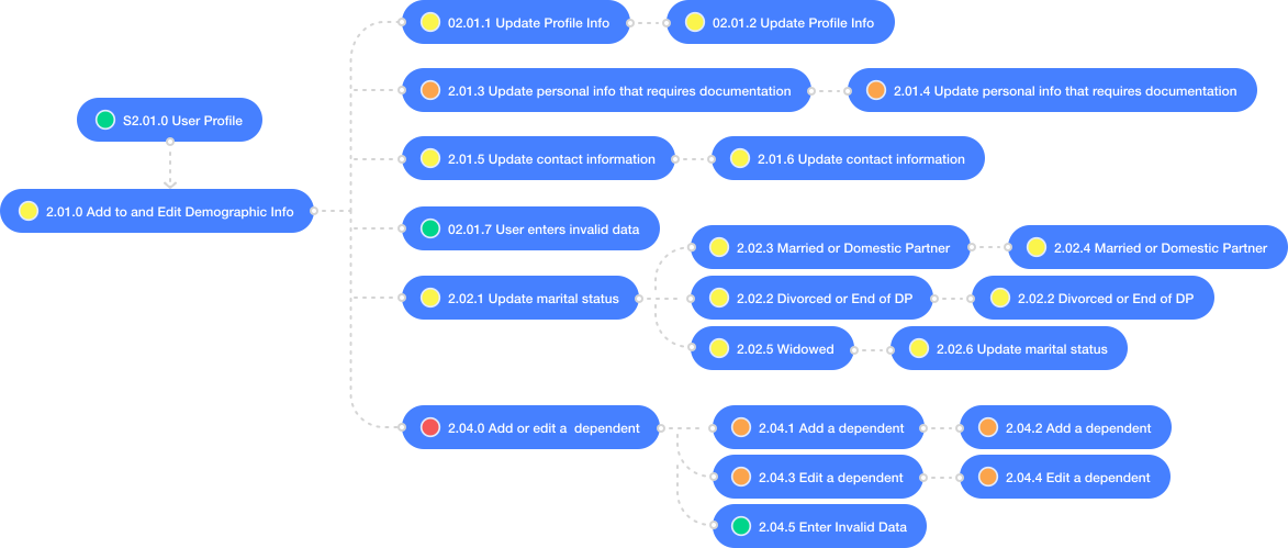
Example user journey from requirements map
Step 2
Rapid Prototyping to Evaluate Vendor Selection
When we brought in an external development firm, I had one sprint to turn our requirements framework into mockups concrete enough to evaluate vendors against, giving each firm a real design to build from rather than an abstract spec.
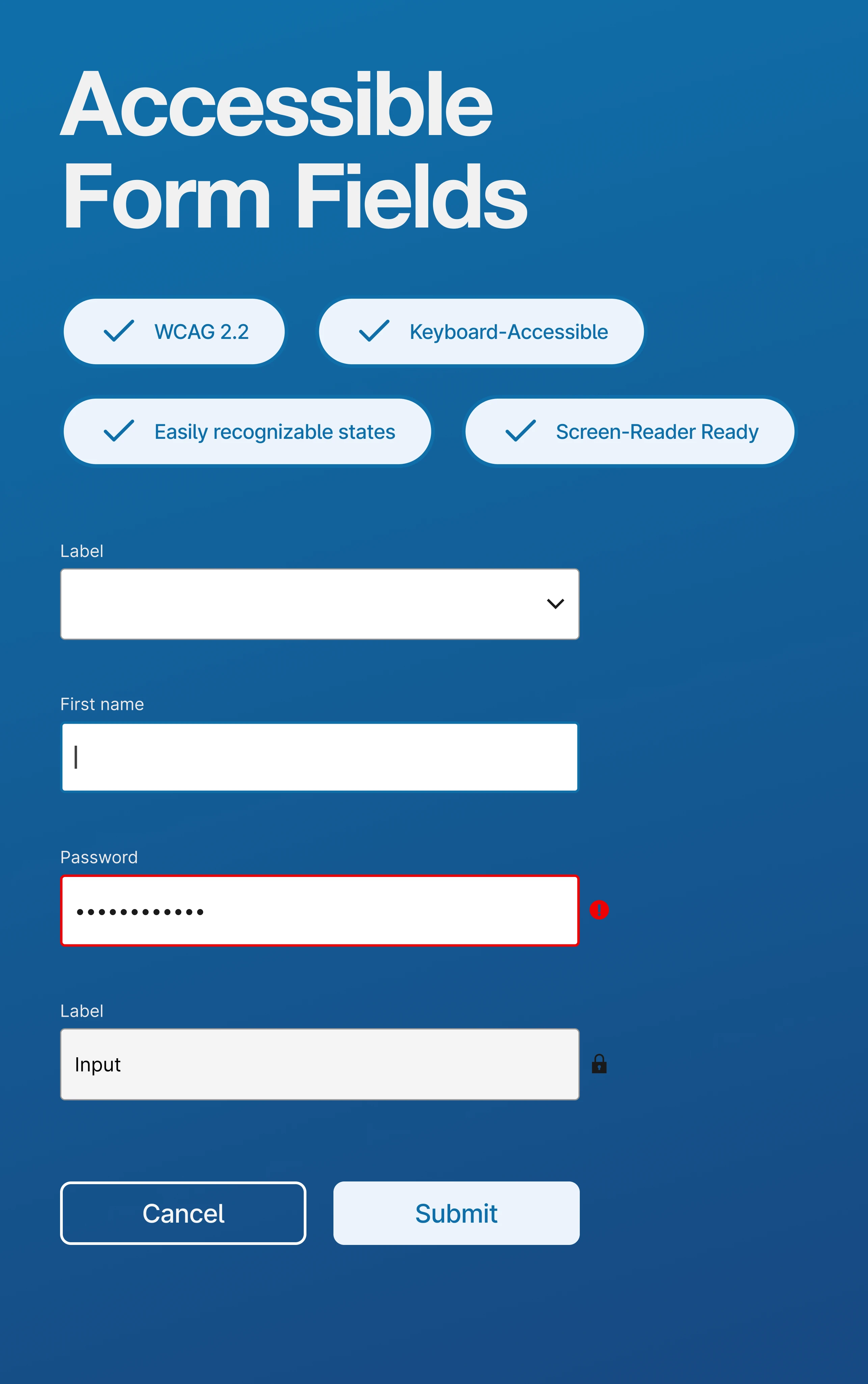
Evaluation went beyond visual polish. I looked at how each vendor handled ARIA labeling and semantic structure, whether their build process could maintain fidelity to the original designs, and how clearly they reasoned through pushback on technical tradeoffs. The firm I selected treated accessibility as a design requirement from day one, not a post-launch fix, which mattered given how many users rely on assistive technology to manage sensitive benefits information.

Step 3
Fidelity Concepts for Smart Decisions
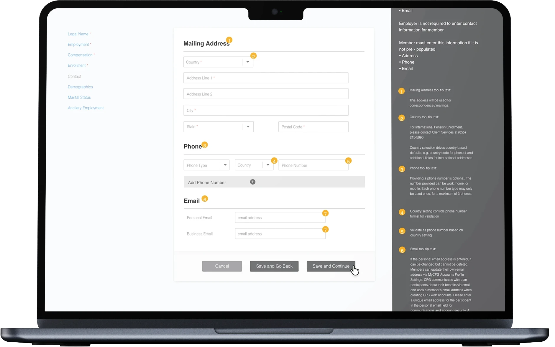
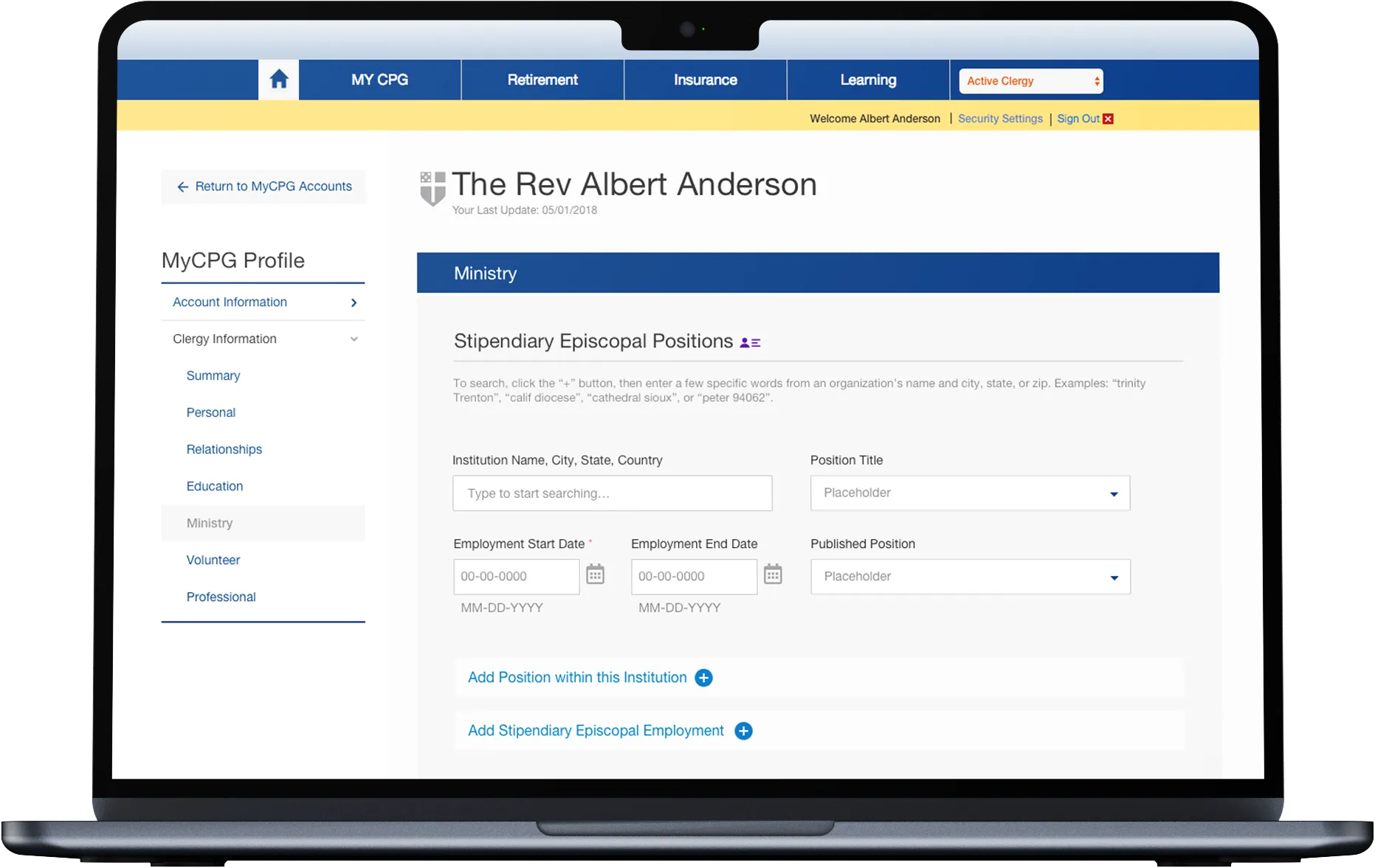
Rather than jumping straight to polished screens, I moved through fidelity in stages, from bare structure to full detail, so problems got caught at the cheapest possible point. Each stage answered a different question: does the structure make sense, does it behave the way users expect, and is it ready to build. That progression kept the team aligned at every step and set engineering up for a clean handoff.
Step 4
User Dashboard Redesign
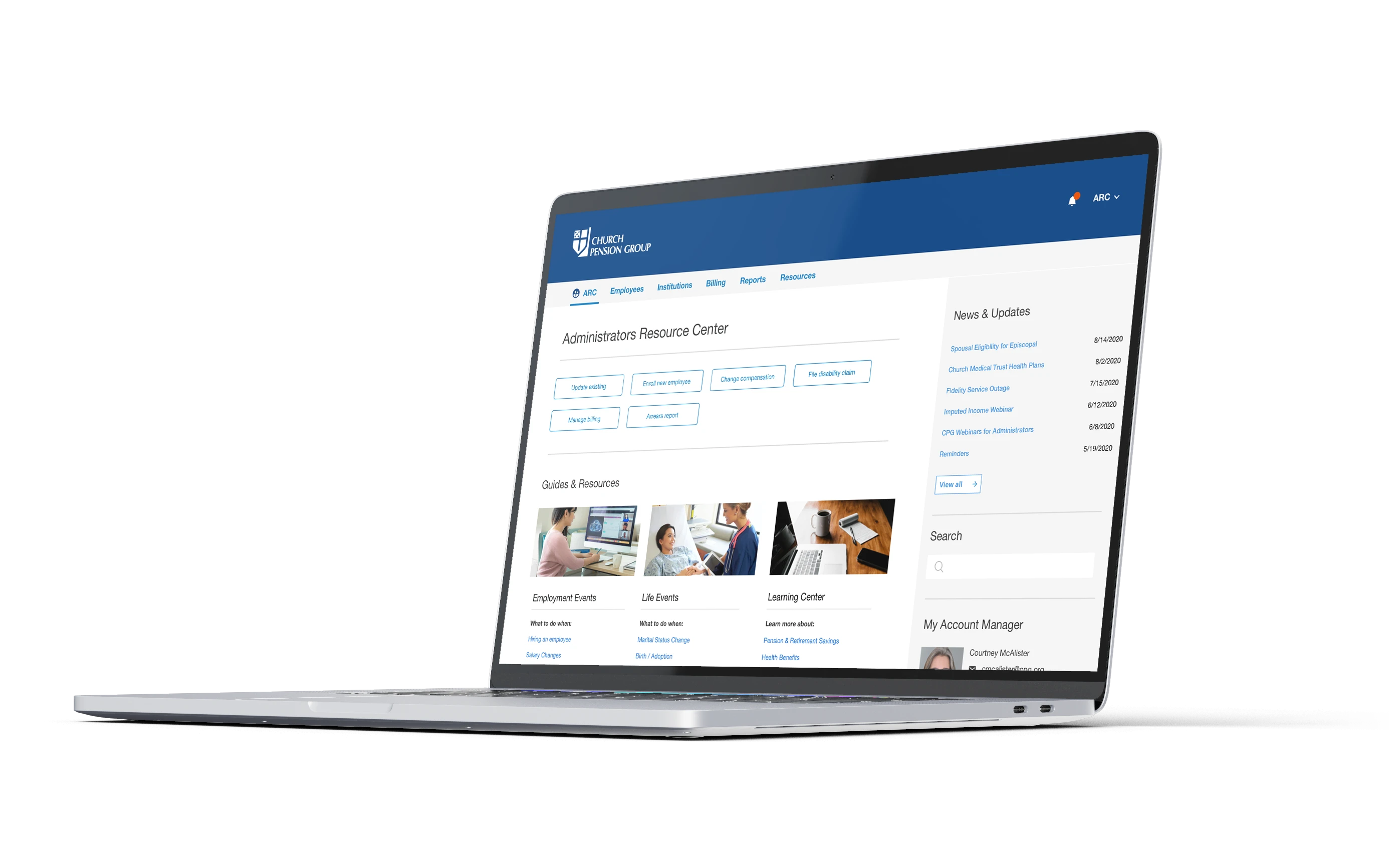
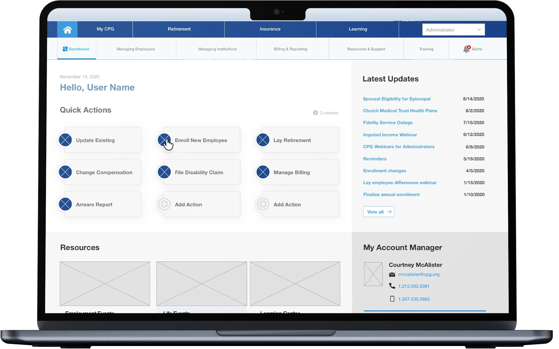
The original dashboard buried critical information behind dense text blocks and unclear navigation. I redesigned it around a simple principle that users should be able to look at the dashboard and immediately understand what they can do and what needs their attention, without reading a paragraph first. I restructured the layout around actionable cards, and prioritized information based on what user research told us people actually needed first, like pending actions and recent changes, over less time-sensitive account details.
Since clergy and lay members access MyCPG across both mobile and desktop, I built the dashboard responsively from the start rather than adapting a desktop-first design after the fact, ensuring the experience felt equally considered on both.

Step 5
Design System and Style Guide
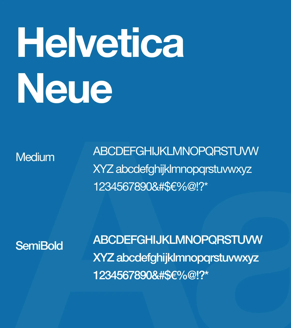
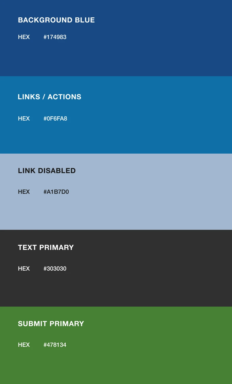
As the project scaled and more contract designers and developers joined the team, inconsistency became a real risk. The result is a documented component library with clear rules for color usage on CTAs and status indicators, and typography standards that met accessibility contrast requirements across every screen.
I treated this less as a style guide and more as a decision-making tool. Every component came with guidance on when and why to use it, so contract designers could make consistent choices without needing to check in with me on every screen. This system became the single source of truth that let multiple teams work in parallel without drifting from the original design intent, and it's still the foundation new features get built on today.
Final Application
User Journey Example
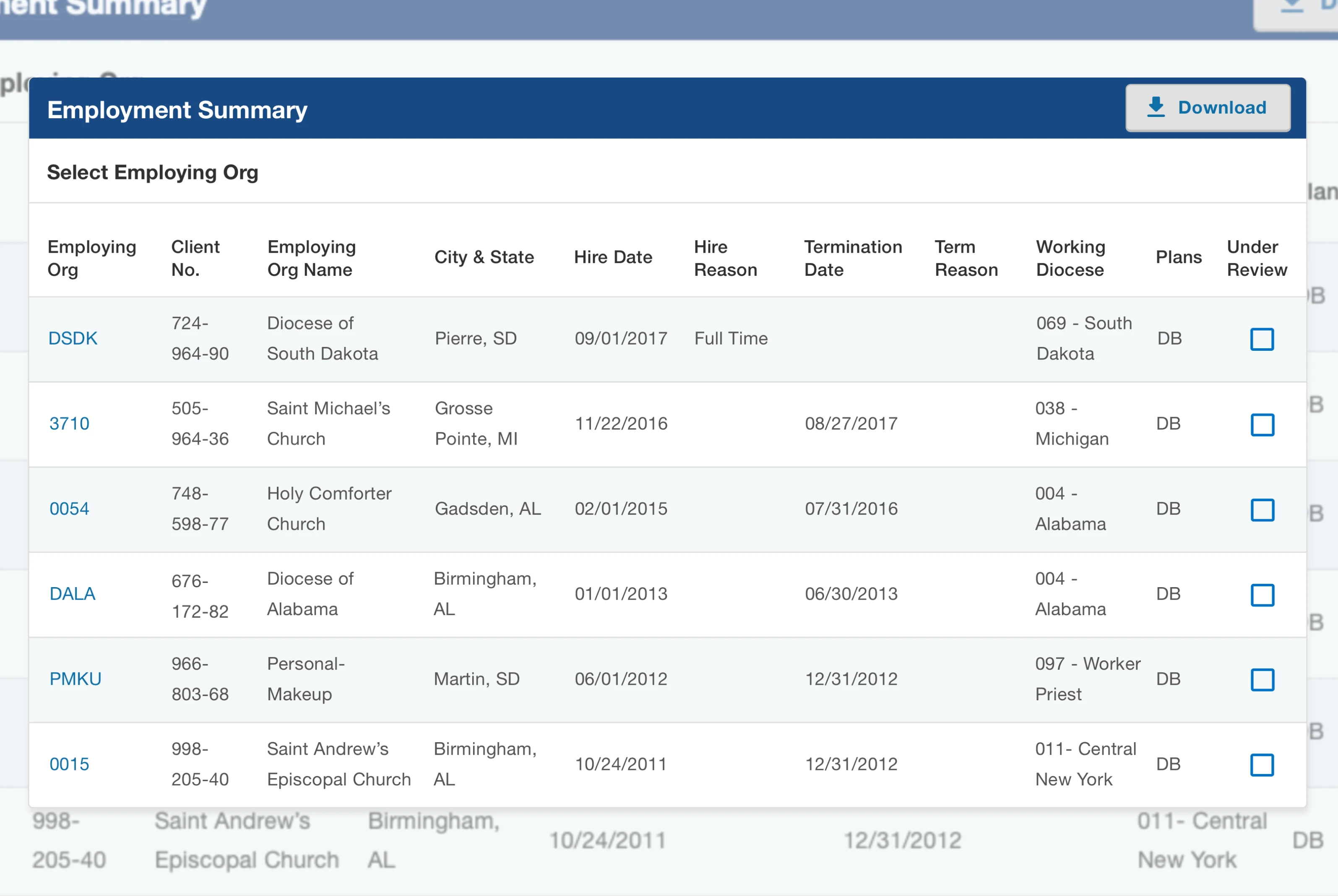
Adding or managing a dependent was one of the most error-prone tasks in the old system. The redesigned flow walks users through each step with clear confirmation at every stage, so there's never ambiguity about whether an action succeeded.
This flow also became a key testing tool. I used it during both usability testing, to validate that real users could complete the task independently, and QA testing, to confirm the experience held up across edge cases like partial completions or invalid entries. It's a good representative example of the broader philosophy behind MyCPG, which was to reduce ambiguity at every step so users trust the system enough to rely on it without backup support.

"Add/Edit Role" Example Journey
Results
The redesign's impact went beyond individual tasks feeling easier. It shifted the relationship users had with the platform, from something they were hesitant to use, to something they trusted enough to rely on independently. That trust shows up directly in the numbers with fewer support calls, higher satisfaction scores, and faster task completion.
It also changed how the team could operate going forward. With a stable design system and a validated set of patterns in place, the team could ship improvements after MVP launch faster and with more confidence, since new features could build on a foundation that had already been tested with real users.
33% increase in self-service task completion.
Self-service flows empowered users to resolve issues on their own, resulting in a sustained decrease in support calls as more users adopted the platform.
Unified product experience
A single platform now enables users to manage a wide range of products and updates across the entire CPG ecosystem, ensuring consistency and ease of use.
Higher usability and confidence
User satisfaction rose from 3.3 to 4.7 after the redesign and comprehensive testing, reflecting a more intuitive and trustworthy experience.
Lower error rates
Usability testing and iterative improvements minimized user mistakes and increased task completion rates.